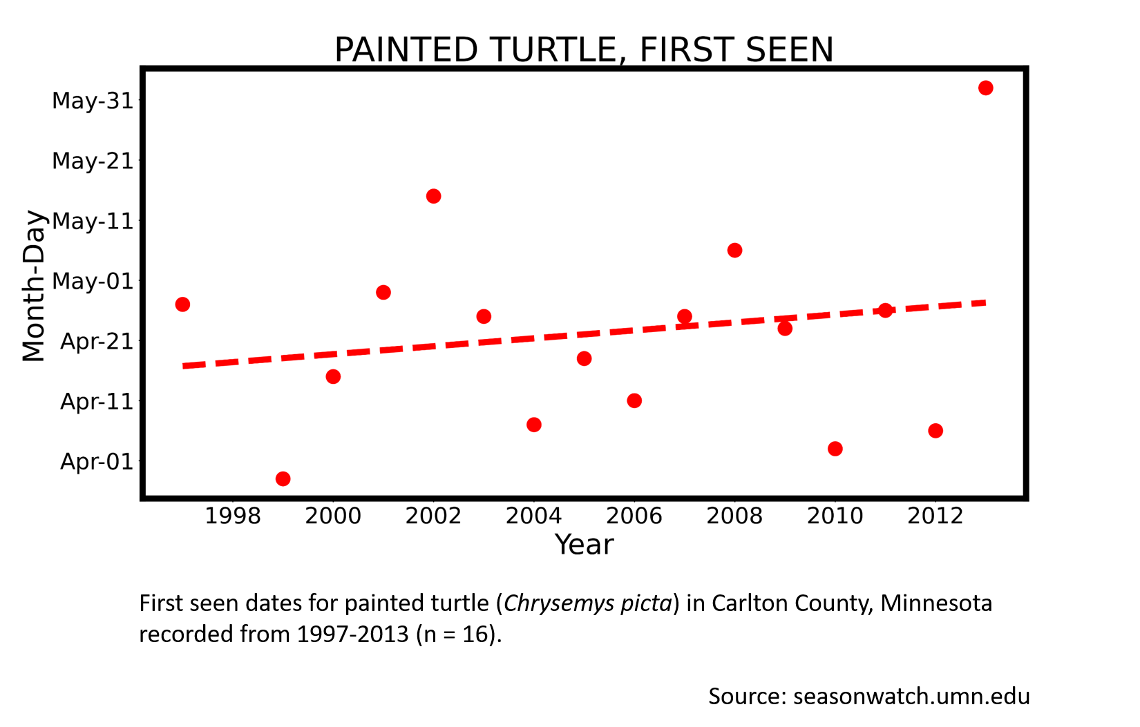
Painted turtle
Transcript
This graph shows the date of first sighting of a painted turtle in Carlton County, Minnesota. Years are on the x-axis, and the date of first emergence is on the y-axis. There are sixteen datapoints. The graph shows a slight shift toward later emergence, so turtles are staying in hibernation slightly longer than they used to.
It’s unclear, however, if this change is statistically significant. The final datapoint is notable. It may be considered an outlier. And I would be interested to see how or if the slope of the trend changes with it removed.
This graph makes me curious to see how the average temperature in each year compares to the emergence date.
I’ll leave you with a fun fact about painted turtles. They have temperature-dependent sex determination, which means that eggs laid in cold nests turn out male, and eggs laid in warm nests turn out female.
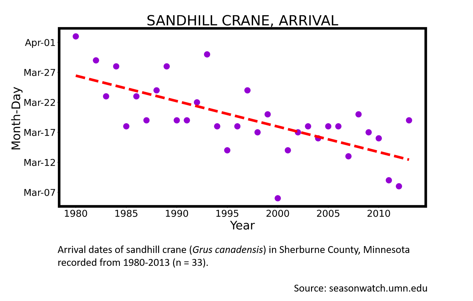
Sandhill crane
Transcript
This graph shows the dates when sandhill cranes arrived in Sherburne County, Minnesota. The x-axis, or lower edge of the graph, shows a sequence of years from 1980 to just after 2010. The y-axis, or left edge of the graph, shows a sequence of dates, from early March to the start of April.
After glancing at the graph and reading the caption, there are always two things I like to do. The first is to consider some previous knowledge I have about this process, or, in other words, what’s the bigger context of sandhill cranes arriving? I know that sandhill cranes spend winter near Florida, and migrate north in spring, which means they get to Minnesota as well as places beyond. I know this is a big and complicated process, and that one observer can only get a general sense of it, but they can’t observe the whole thing. Therefore I know the graph will be a simpler version of what’s happening in the real world.
The next thing I like to do is to think about the observer and their process. Because the graph is about “arrival,” this suggests that the cranes were absent at some point. So I imagine this observer is regularly looking and listening for cranes. I am picturing them outdoors in February, looking and listening, but they don’t detect any cranes. And then suddenly one day in March, a first crane is seen and heard. And the observer records that. So that moment of first detection within a year is shown on the graph with a single purple dot. Then the observer repeats that process every year, from 1980 to 2013.
So the next thing that I like to do is I look at overall patterns. The red dashed “trend line” helps to describe what is happening overall with the purple dots, as one moves from left to right, through the years. The downward slope suggests that the timing of arrival is shifting earlier as the years go on. So if in 1980, it was reasonable to expect the first crane in late March, it looks as if by the early 2010s, that timing has shifted to early March. The difference is roughly two weeks.
My next step is to simply get curious. This graph is like the raw ingredients for an investigation. We see that on the whole, cranes are arriving earlier, although there is a lot of variation. And overall we are left to wonder why. What signals in the environment do cranes use when they fly north? Is it snow? Temperature? Food availability? And if they arrive earlier, do they have the same success at setting up territories and raising young? I also get curious about what’s not in the graph.. For example, if we could imagine the graph showing us more to the left, in other words, years earlier than 1980, would the dots take on a flatter pattern? After all, Minnesota’s climate was more or less stable between the last ice age, 10,000 years ago, and the relatively new event of climate change. So it makes sense that cranes evolved to migrate in a climate that was stable and different from what we have now.
And overall, I’m happy looking at a graph if I have a clear sense of how it was made, even though I have a lot of questions about what it means in terms of why things are happening or what effects might come in the future. The graph just makes me curious to go looking and listening for more cranes, and to get more information.
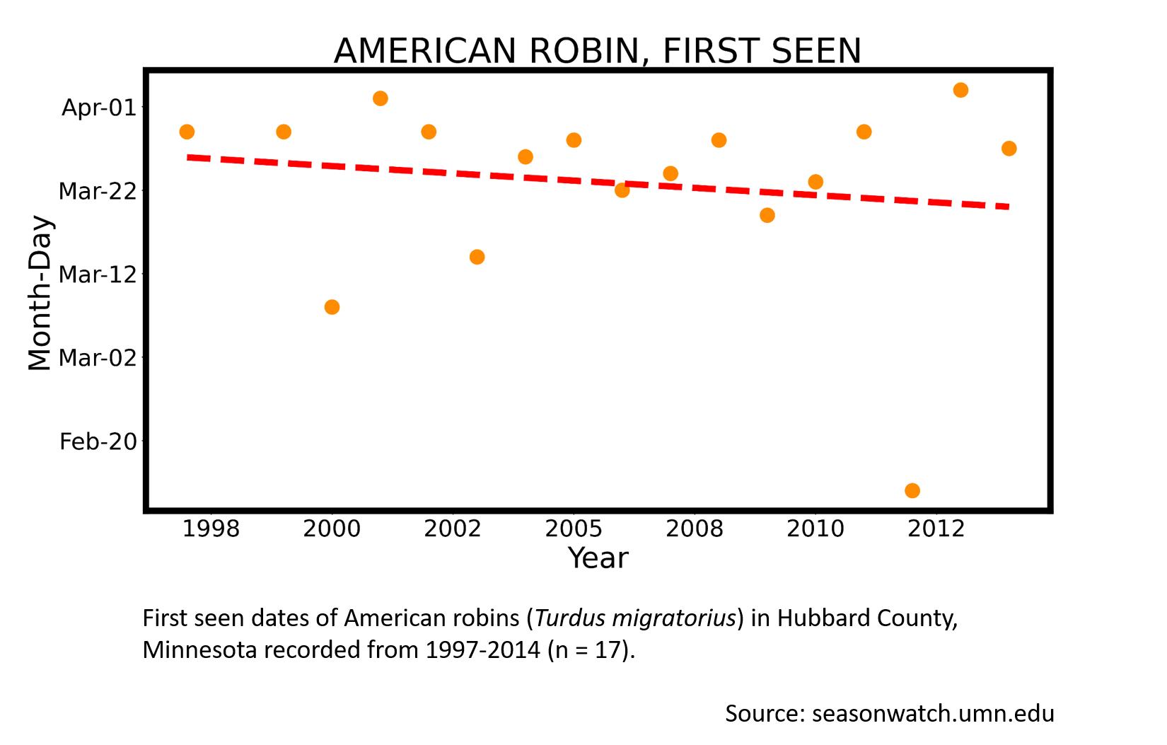
American robin
Transcript:
Looking at this graph of spring migration of robins, there are a few dots that are lower than the others, especially this one in the lower-right corner. That dot corresponds to a date of February 13th, in 2012, and it for sure doesn’t conform to the rest of the datapoints. This graph shows robin migration observed in Hubbard County, not too far from where I live and observe, in the Grand Rapids area. Where I am, we often have a robin or two that appear during our Audubon Christmas Bird Count in December. These are robins that have chosen to stay in the northland throughout the winter.
How, then, do I separate those wintering robins from the migrators who typically arrive in mid March? It takes practice and some familiarity with the place where you observe, because it’s nuanced. But here’s my experience: If I see a robin and then in the next few days I see others, or if I hear of other observers who are seeing robins at the same time this is often the beginning of robin migration. Another sign of migration is singing. The returning birds will announce their presence by singing. This is the first step for robins acquiring their territory. As the migration develops, flocks of robins will move through.
So, sighting a single robin in January or February may lighten your spirits, but unless it is backed by further evidence, it’s more likely an over-wintering bird, and less likely to be a migrant signaling their return from farther south.
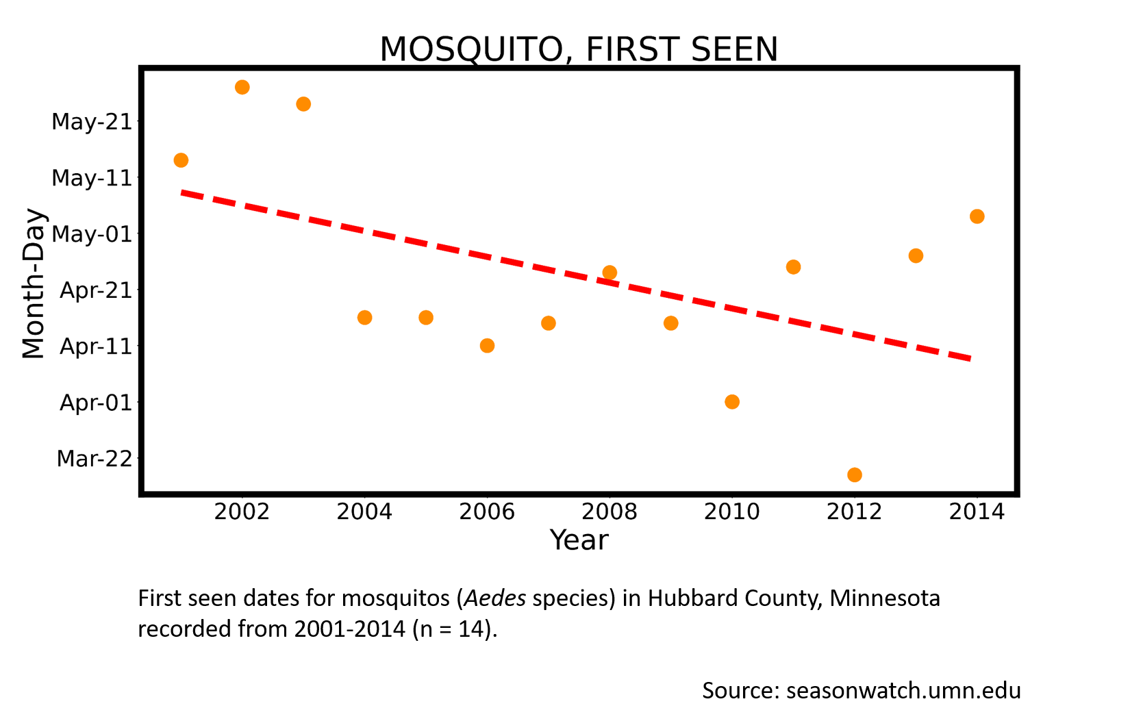
Mosquito (Aedes species)
Transcript:
Hello folks. Welcome to yet another audio on interpreting the phenology data. In this scatterplot, we plotted first seen, or first observed date for the Aedes mosquito species. The data is from Hubbard County in Minnesota. The x-axis on this plot represents the year, and the y-axis denotes the calendar date. Data spans fourteen years, from 2001 to 2014, and corresponds to fourteen datapoints, and were collected from mid-March to late May, depending on when the Aedes mosquitoes were first observed annually at Hubbard.
The fitted regression line suggests a declining trend, meaning that the time adult Aedes mosquitoes were first seen at Hubbard advanced by about one month. The Aedes mosquitoes, which used to be first observed in Hubbard County only by roughly the second week of May during the early 2000s, have begun to be seen as early as the second week of April by 2014.
Wow! That is, in less than a quindecennial period, that is, fifteen years, the phenology of Aedes mosquitoes, in terms of their first occurrence at Hubbard, has advanced by nearly one month. This corroborates very well with the recent finding by Climate Central, that the warmer climate has added an average of forty-two ideal mosquito climate days annually in the Twin Cities. The mosquoito season in Minneapolis has expanded from the average seventy-four days per year during 1980-89, to 108 days per year since 2006.
Now, you may be wondering if the datapoint for 2012 on this plot, recorded on March 17, St. Patrick's Day, is an outlier or not. It is truly not an outlier. Average temperature for Hubbard County for March 2012 was thirty-nine to forty debrees Fahrenheit, which is sixteen degrees warmer than the usual average temperature of twenty-four degress in March.
While I do not have volumes of data at my fintertips to speak for Hubbard, you may be fascinated to learn that March 2012 brought six record high temperature records in the Twin Cities region and had its earliest eighty-degree Fahrenheit temperature ever, on St. Patrick's Day, March 17th. Average temperature for the Twin Cities for March 2012 was also sixteen degrees Fahrenheit warmer than the usual. As a consequence, spring phenology was exceedingly early in 2012. Even the lilacs bloomed the earliest on record in the Twin Cities in 2012, with many reaching full bloom by mid-April.
Long story short, the longer frost-freeze seasons in Minnesota come with a price. With warming, the expectation is for increased rates of mosquito diseases, and for that matter, even tick-borne diseases, and they're likely to have a negative impact on the public health.
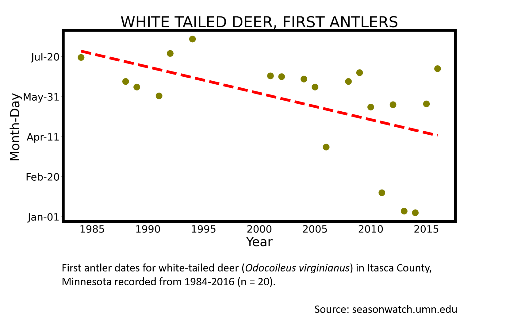
White-tailed deer
Transcript:
When I read a graph, I always begin with the title. This graph is about white-tailed deer and their first antlers. Next I read the caption, which specifies that these first antler observations are from Itasca County, from 1984 to 2016.
My next step is to orient myself using the graph’s axes. The x-axis agrees with the caption, plotting out a sequence of about thirty years. The caption says there are only twenty datapoints, so I know right away that not every year has an observation. And that makes sense because I see some gaps in the dots as I move from left-to-right. Then I orient myself with the y-axis, and I right away notice that a large portion of the year is depicted, from January at the bottom to July at the top.
Next I try to get an overall sense of how the dots and the dashed line relate to one another. It looks like most of the dots are in the neighborhood of June and July,, but about three points are relatively low. Check out the lower right corner. It looks like those three observations happened in January and February. And another dot in April doesn’t fit very well with the general June timing.
My next step is to remember that the graph is a simplification of a complex process in nature. And in thinking that, I like to recall any previous knowledge I have about what the graph is about, in this case, deer getting their antlers. And here's some things I know:
- Male deer grow and shed antlers every year, and this change in their appearance is connected to breeding.
- New antlers start off as nubs and grow to full size around the end of August or early September.
- When antlers are growing, they are covered in velvet, a kind of tissue that supplies blood to the growing antlers.
- Males rub off the velvet against tree trunks. That rubbing action also helps them test the strength of their antlers. Because all of this is leading up to the rut, or breeding season.
- >Male deer fight one another. Using their fully grown antlers, they spar as a way of demonstrating strength.
- After the breeding season, bucks typically lose their antlers.
But not every individual male deer in a population follows that pattern to the letter. There is some evidence that lower-ranking deer maintain their antlers well into winter. These are generally individuals who were not strong enough to be successful at breeding.
So putting together what I know with what I see in the graph, and keeping in mind that the graph is a simplified picture of a complex biology, I start to build more understanding. The dots that fall in January, February and maybe even April might be deer who did in fact have antlers, but they just weren’t new antlers. So I build in my mind’s eye a picture of what I might expect to see – deer with polished and pointed antlers, rather than velvety new nubs. All this thinking is useful because it helps me know what details to look for when observing deer phenology. And also what details I would need to write down so my data can be made sense of by others.
In fact, I asked this observer from Itasca County who is very savvy. And he did in fact tell me that in his notes, he wrote down that he noticed polished antlers in those early observations. And you wouldn't have seen polished antlers if they had been new antlers growing.
This is a useful lesson because data are raw ingredients for investigating and for learning more. The nature of a dataset is to simplify what is inherently a complex process, and sometimes information can get a little misinterpreted in that process of simplification. So always try to look with a critical eye. And I challenge myself to hold more than one possible interpretation in my mind at the same time. I get curious about, for example, what would happen if I were to drop a few of those observation points from the dataset, what would the average then look like? If you’re curious about this, you can download the data and explore it using your own copy of the spreadsheet. But overall, my takeaway is that even if the graph leaves me with some questions or some uncertainty, that's acutally good because those thoughts will help inform how I look for evidence when I’m outdoors.